Spring - Summer 2020
The challenge
To create an online tool for the team of writers.
My role
UI design and front-end development.
How it all started
It all started with an email, which asked the students to check out the new website for the university newsletter. I was curious about what they have come up with and clicked on the link. What popped out did not surprise me at all: WordPress, ugly and unsuitable typefaces, weird positioning and a nasty pile of ads; but I have to admit that this was a good try from someone who had never developed anything.
I had emailed the author and got a response to having a look at site myself. After getting the admin credentials and playing around with WordPress, I had realised that I hate it even more than I thought. Eventually, I came into a decision to develop a new website from scratch.

The old version of The Jazette website
Analyzing the problem
Ideally, an online newsletter website should be easy-to-navigate, comfortable to read, simple to write and manage the articles, yet have an elegant design. How to achieve this? I offered my friend to work on this project together as he had experience working with WordPress.
The main obstacle was to build such a system which would allow creating, edit, read and delete articles. We were deciding between WordPress, other Content Management Systems (CMS), and building our own custom CMS. We got rid of WordPress because it was hard to customize, maintain, and add new features without creating even more problems. We gave a try to create our own custom demo CMS from scratch.
The kick-off point was a basic demo by Matt Doyle written in PHP. The demo handled basic functionality of creating, posting and reading the articles, while having an admin page. We decided to stick with a custom CMS, and the main task was solved.
The approach
The next stage was to build the interface design. The core qualities
the website had to have:
1 Comfortable maintenance. The process of writing, editing
and publishing of articles must be as intuitive as possible.
2 Readability. The most common problem of websites
nowadays is poor typography.


Interface mock-ups
Rethinking editorial panel
Creating navigation
The whole idea during the creation of the editorial panel was to keep it simple and easy-to-navigate (as natural as it might seem). The usual CMS's end up being functional, but as user-unfriendly as possible. When someone unfamiliar with content production tries out WordPress, the person gets confused in the dozen of unnecessary links and gets overwhelmed. Instead of creating the content and focusing on it, the one only tries to learn how to use this overcomplicated tool.
The solution was found, by playing around with navigation bars (and some inspiration from the internet, of course). In early stages, navbar from the "Reader-part" of the website quickly transformed into a sidebar. It was more appropriate because it had several critical advantages: mainly, it had enough room to contain the logo, links and status message.
Icons, the simple rule is: use icons from one family — stick everything to one style (it does not apply only to icons!). Self-descriptive links help to navigate intuitively, and attractive, juicy "new-articles" button stimulates to create content.
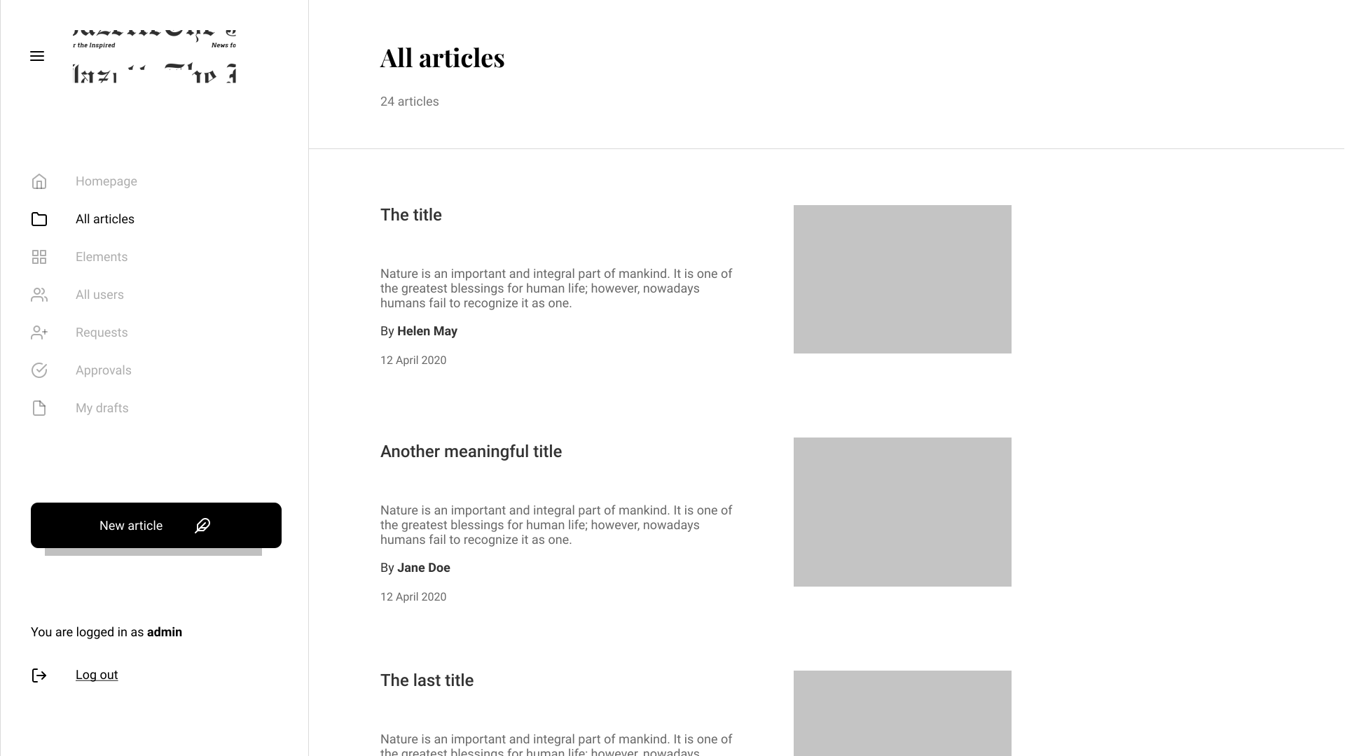
“All articles” page, demonstration of sidebar
Writing process
In the demo, the article content had to include HTML tags to display on the screen properly. This might lead to confusion among the writers who are not familiar with HTML, but even if there was no such a problem, the process of writing HTML tags to make the text look properly is a weird process by itself.
The decision was to create such a text field in which would allow formatting text on the fly. The main source of inspiration was Grammarly (the process of writing the text). But how to realize this complicated input field? Luckily, there are plenty of tools which could be integrated into the website and do what we wanted, and it was free. Our choice lied upon CK Editor.

“New Articles” page
The whole process is created in such a way that the writer is focused on the text. Secondary information such as a short description, the cover of the article, and the author of this cover is hidden in a pop-up.
Apart from that, we have built the whole workflow structure: when the author has finished the article, it is sent for review. Then the editor checks the article, and if everything is correct, it is approved and posted. If not, it is sent back with comments. Then the process repeats. That’s it. Now, the team members do not have to send their articles via email, which is time-consuming and annoying.
Mastering typography
What makes a good reading experience? Content? Yes, but good typography is also very crucial, people usually tend to be more tolerant towards any content with good design.
How to create good typography? Well, the text must be easy-to-read. How to achieve that?
Simple rules to make text readable:
1 Standart text size for paragraphs. It means that if you
take your phone, place it in your usual reading position, sit in
front of your computer screen (usually, the distance), and compare
the text. The text size must be more or less equal.
2 Active white space. The text must breathe. The space
surrounding the text reduces the amount of effort needed to
concentrate on reading.
3 Sufficient line height. Default HTML line-height is usually
too small. Adding a bit of line-height makes the text far more
readable.
4 Color contrast. On the white background, it is preferred
not to use completely black text. And vice-a-versa, on the greyish
background, it is recommended to use black text. However, this is
not a strict rule, rather a recommendation.
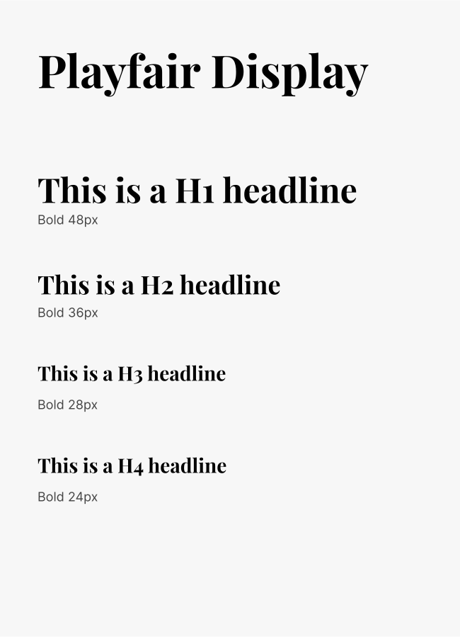
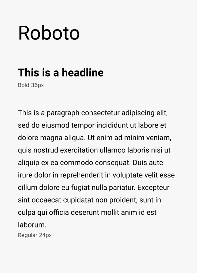
And of course, typefaces themselves. I picked Playfair Display for headlines and Roboto for primary text. It makes the overall design look simple and formal, yet elegant. The reason behind choosing Sans Serif typeface for primary text is because it is cleaner and does not stress the eyes while reading by placing unnecessary details.
Results
What did we get in the end? In my opinion, it is a useful tool which allows the creators to express their passion much more efficiently, and face recognition.


The final version of website
Conclusion
In the end, I gained at least slightest understanding of how CMS's work and how complicated the development of those are. This project allowed me to improve myself in the direction of project vision and understand that there is still much to learn.